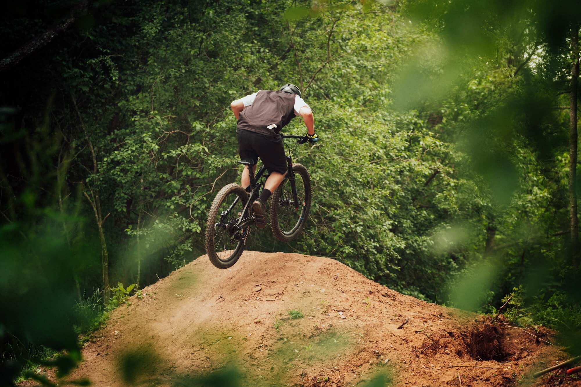
Bryce Resort
Web Design & Branding Refresh
A mountain resort nestled in the Shenandoah Mountains that specializes in mountain biking, snow sports, and golf.
A Quick Overview
The marketing director at Bryce Resort reached out to in early 2021 with plans to redo their website. The original website was unable to show the beautiful videography and photography they had for the resort, ran slowly, and was visually outdated. I dove into designing the resort a new site that modernized their appearance and helped them achieve their goal of growing their members and visitors each year.
Roles: UX/UI Design, Branding Design

Branding Refresh
2021
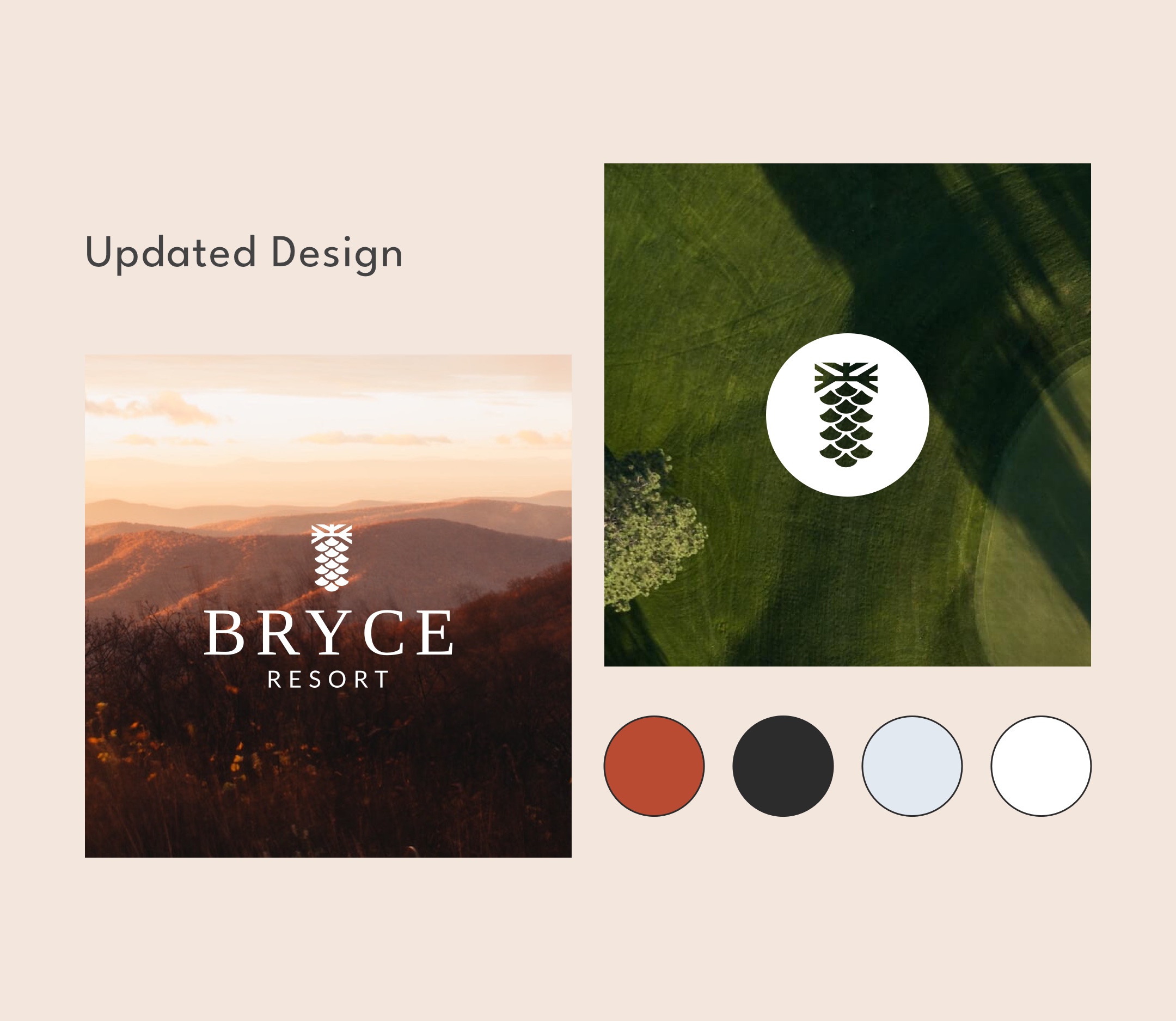
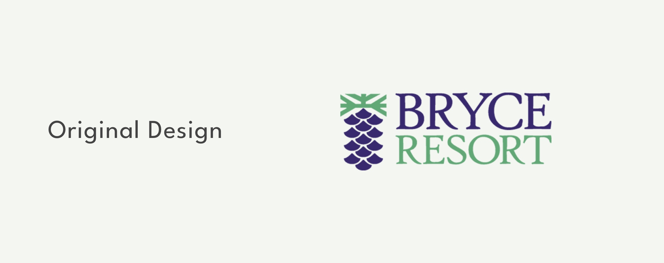
Our partner at Bryce requested that we start by revisiting the resort's branding as the old logo, colors, and fonts felt dated in color and appearance. He advised that for the changes to be approved they would have to stay true to the general feel of the original logo. As a result, we kept the updates simple and focused on modernizing the look while still keeping it recognizable.
These logo changes have now been widely adapted and are used in Bryce Resort promotional marketing materials.
We also updated the color palette to pull in the natural colors of the foliage and nature surrounding the resort, pulling away from the bright greens and purples that were previously used.
Website Design
2021
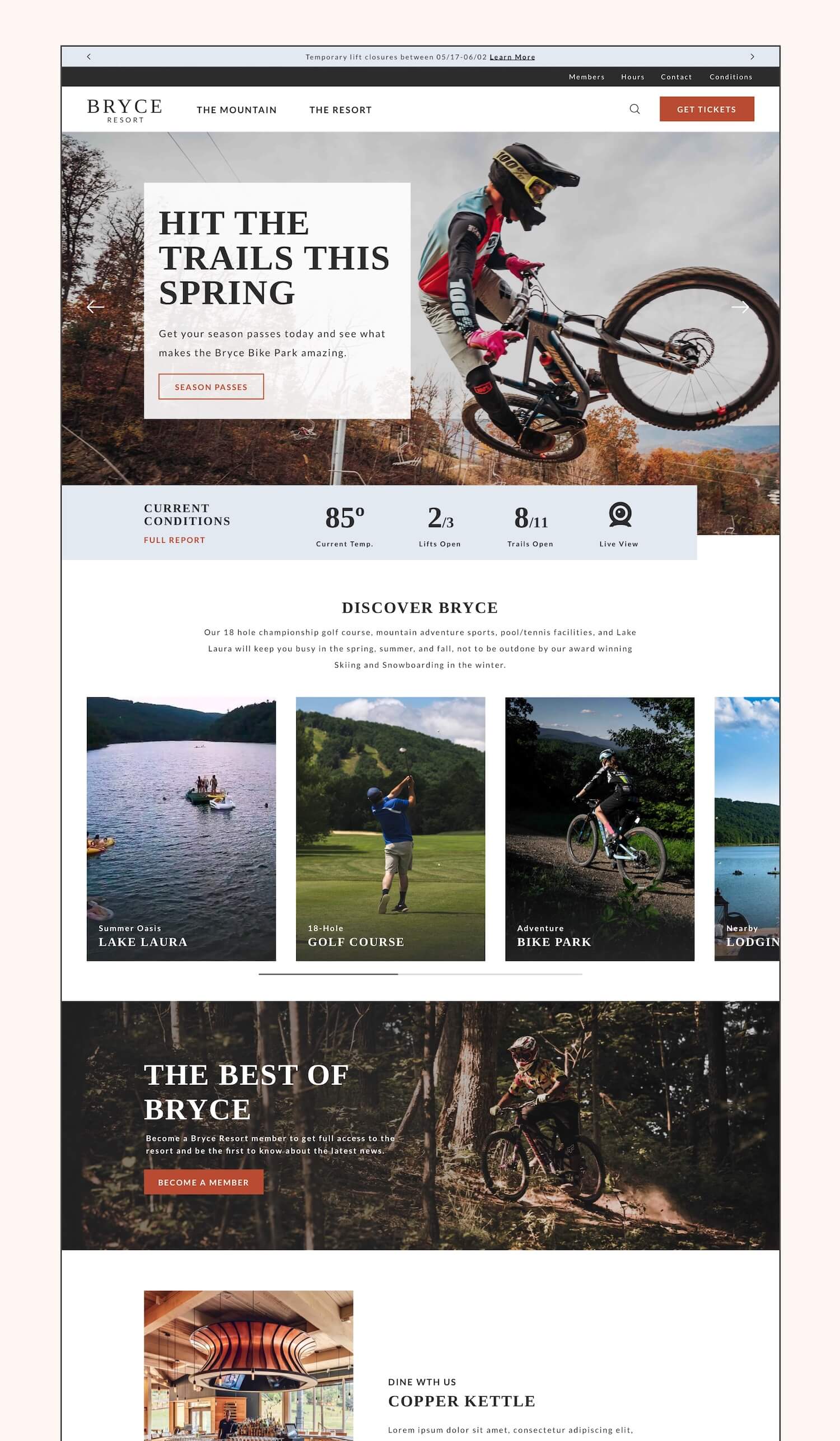
The design of the website itself needed to serve a variety of purposes that weren't being met by the former site:
Highlight was the beauty of the resort through photo and video media
Improve the information architecture to make the site easier to navigate for users and staff
Implement the current booking engine in a more seamless way
Make various tickets easy to find and buy
Design content blocks that could be easily interchanged and updated on a season by season basis
Create a site that was more modern and on par with other resort websites
Design for the new Bryce website began with a full crawl of the original site to determine: what pages were present, what needed to stay, and what ultimately needed to be removed or changed. I then completed a full information architecture workup that redesigned how the site structure would be laid out.
Content was then revised on a page by page basis in partnership with the Bryce team before moving into wireframes and mockups for the new site. I presented several look and feel options before setting on a direction that we nicknamed "Clean & Modern."
The wireframes and mockups for the site were then designed using Sketch and InVision and ultimately built out on the Statamic CMS. The final site showcases a robust mega-menu, easy to find tickets, activity pages with customizable sections and blocks, events, a password protected members portal and voting system, and so much more.